Wednesday, March 18, 2009

Sketch Series 4

Find installations of the six types of lamps mentioned in the book. For each installation respond to the items listed below:
a. Identify the purpose of the space.
b. Identify the purpose of lighting, including an identification of ambient, task, accent, and sparkle lighting.
c. Identify the lamp/s
d. Describe the luminaire
e. Describe the effect of each light source in each space.
f. Describe the effect of each light source on materials.
g. Evaluate the appropriateness of the illumination levels.
h. Based upon your observations and reflections, provide recommendations for improving the lighting environment.

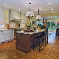
FILAMENT LIGHTINGa) The space shown above is a kitchen space where people will be gathering to prepare, cook, and eat food.
b) The lighting is task lighting over the island in the kitchen where the filament lighting fixtures are placed, This lighting is helping to illuminate the space where prep and eating will take place.
c) The filament lamps are located over the island in the center of the kitchen
d)
e) Since the light fixtures are above the island only, they only effect that small space in the kitchen. They do not provide enough light to illuminate the entire space, but they do their job of providing light over the space they were designed to illuminate.
f) The light fixtures above the space shine down directly onto the countertop. I'm not sure of what material it is. It appears that the light shining down creates some glare and shows reflections of other objects in the space. The color of the material keeps it from being too bright and disabling the viewers sight.
g) From what I can tell from the photograph the illumination level appears to be adequate for the purpose of the space. It is not too bright, which would cause great amounts of glare, but it is also not dim which would cause the inhabitant to strain to see.
h) I believe the lighting fixtures and exposure of light are suitable for the environment. The photograph portrays the space to have adequate amounts of lighting to perform any task at hand. Although there is some glare off the countertops this does not interfere with the viewing of the space or the purpose of the space.

COLD CATHODE
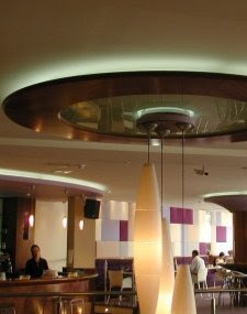
a) This space is a restaurant/bar area.
b) The lights are used as a type of accent lighting to illuminate where that particular seating area is.
c)The lights are located at the top and appear to be cove lighting
d)
e) These lights do not have an effect on the table space but, the light up the space as a whole. The add light to the ceiling which reflects down. It adds a nice touch to the vertical elements in the space
f) The light source only hits the ceiling which is not a reflective material so it does not produce glare. It just directs the light down.
g) The illumination level is bright, which causes it to pop out against the more dim lighting.
h) The illumination level should be dimmed somewhat because it causes the focus to be at the ceiling.

FLUORESCENT
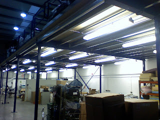
a) This space is a factory and/or storage space where many boxes seem to be stored
b) The lighting is ambient lighting. It is uniformly lighting the space
c) The lamps are located uniformly along the ceiling
d)
e)The light sources make the space very bright.
f) There are not many reflective surfaces in the space so no glare is produced. It does provide reflection on the concrete floor.
g) The illumination levels are reaching the point of being uncomfortably bright.
h) I would dim the lights down some and add color to the walls so everything isn't a bright white anymore.


CERAMIC METAL HALIDE
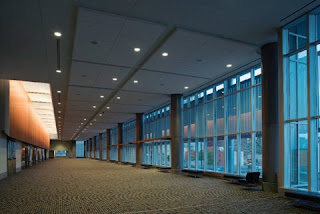
a) The purpose of this space is a wide hallway or a lobby of some sort.
b) The lighting of the ceramic metal halide in this space creates accent lighting along the wall
c) The lamps are located along the wall where the wood is placed. They are in that cove shining down creating a wallwash.
d)
e) The lights are contained in the small space along the wall so they do not illuminate anything in the space other than the wood paneling along the wall. It does brighten up that side of the space along the wall though.
f) The wood paneling material absorbs the light pretty well while still allowing some reflection off of it into the wide lobby area. Although the wall appears bright it is not difficult to look at.
g) I believe the illumination level fits the atmosphere that this space seems to create. It adds a focus to the space. If it was dimmer there would be nowhere to focus.
h) I would extend the paneling further towards the floor and allow for more light to pop off that wall into the space.

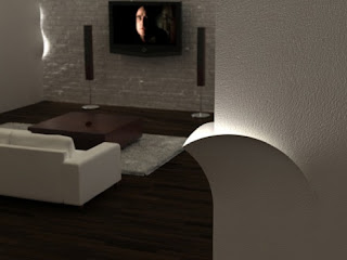
LED LIGTHINGa) This space is a living room or seating area.
b) The lighting from the sconces are accent lighting.
c) The lamps are located along the walls.
d)
e) The lights provide a glimmer of light along the walls to add some extra light to the space they do not add much illumination.
f) The lights reflect some off the wall material but not much.
g) The light levels are bright but they are in a small area so I believe the illumination level is appropriate.
h) I would only add more sconces along the walls.

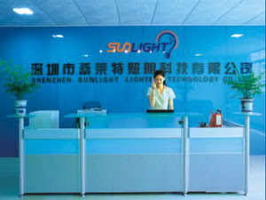
ELECTRODELESS LIGTHINGa) This space is a lobby desk area.
b) The purpose of this lighting is ambient lighting.
c) The lamps are located uniformly overhead.
d)
e) The light source produces adequate amounts of light for the space.
f) There are not many reflective materials so glare is not produced. Most of the materials absorb the light.
g) The illumination level appears to be too dim for the space. The light should be brighter.
h) Brighten lights in the space.

Day Light Model

For this light model we had to design a daylight model in our groups. We were to choose a designer and study their daylighting techniques. We choose Steven Holl to study.

INSPIRATIONS
We chose to study the product design of Steven Holl and explore the ways he showed light through his works. In many of his works he makes several small cutouts that create a pattern on the object they reflect onto. He intersects different places that all have cutouts on them to create an image that reflects onto a surface. We used this idea to create an active, liveley space on te gathering side of our model. We studied the MIT dorms and drew inspiration fromt he square cutouts on te facade of the building and incorperated that into the intimate side of our model. Holl uses clean lines to create geometric shapes in his works.

DAYLIGHT MODEL
We control the daylighting by setting the orientation where the gathering space is on the East and the intimate space is on the West. The wall with no cutouts in facing the North side. We did this so the sun would penetrate the building through the L shaped cutouts, because this is a more active space where more complex daylight shoudl be present. We avoided direct sunlight to keep from obscuring the views of the people using the space, not creating glare.

Sketch Series 3

In this sketch series we were asked to select four fabrics with warm colors in a variety of textures. We were to take those fabrics to a variety of interior lighting settings, including a grocery store, retail store, a residence, and a library. We were to record these findings and discuss how the light changed the colors and what affect it had on them.

GROCERY STORE--HARRIS TEETER

The light source in this space is flourescent lamps overhead that create ambient lighting for the space. This light is very intense lighting, as it should be to clearly light the entire grocery store. I believe it is good for a grocery store to be lit this way. It is a space that is lively and people are constantly going. The bright lights help to create this lively atmosphere and they also liven up all the colors in the space making the grocery store seem very colorful. It is not too bright and colorful that it is uncomfortable. The lights do not create much glare in the space either.
Under this type of lighting the color fabrics appear brighter and to have a yellow tint to them. For the most part though, the colors appear true to what they really are.

RETAIL--PAC SUN

Pac Sun was lit by all track lighting that was directed at the clothing in the space which are the focal points of the space. The types of lights used in this space were 60 watt halogen lights. The lighting was also ambient overhead lighting. The color fabrics in this space under the lighting seem to be a little washed out (which is shown in the first photo). The blue appears extremely light compared to the original fabric color. The green also appears to be washed out. The red and orange do not seem affected as much by the lights.
I believe this is a problem for a retail space since they are displaying clothes of many colors for people to buy. They should provide light that shows the color true to what it really is so that customers aren't upset when they view the clothes under a different light.

LIBRARY--BARNES AND NOBLEThe lighting in this space is fluorescent lighting. The lighting in this space kept the colors true to the originals. The light isn't directly hitting the fabric so this may have resulted in the true color. Much of the objects in the space are vertical so it is good that the color on a vertical surface be true to the original.

RESIDENCE--MY APARTMENT
I was really surprised to find that my apartment lighting showed the color on the fabric to be fairly true to what they really were. The lights in the living room of my apartment are incandescents. This one light is in the middle of the space. The table that I took the pictures on was located directly under the light fixture. This may have resulted in a truer color being produced in the living room. There are also more warm colors around this space which keep the reflection down. The kitchen space is much brighter, but the colors still remain fairly true to themselves.

Sketch Series 2

This light series asked us to visit a) an art museum, b) a restaurant, and c) a retail store. For each of the spaces we were to record the type of luminaire and lamp and the location of the fixtures.
a. A summary of illumination for each space
b. Recommendations for problems associated with brightness or glare.
c. The effectiveness of patterns of light and shadow and provide recommendations for improving the patterns.


MUSEUMAs you can see the walls in the art gallery are painted white while the art being displayed pops off the white walls. The space is lit by track lighting that is directed at the art on the walls. There are also lights directed down towards the ground. There is not much glare in the space. they way the ceiling is designed and the way the lights are directed keeps the glare away. The lights create patterns along the walls and floors close to the wall. The floor is darker than the walls, but it is still light enough to not distract the viewers from the art on the walls and the lights also direct the attention of the viewers.


RESTAURANT
Shanes Rib Shack is lit mainly by recessed lighting throughout the entire space. The ceiling is black to also keep the glare down. There is some spotlighting along some of the walls, but not over the places to eat.
There is slight glare over some of the booths where there is direct pendant lighting. It is directed at the center of the table which doesn't pose a problem to the guests dining in the restaurant. The light in the space is evenly lit among the space as well.

RETAIL STORE
Pacsun is solely lit by track lighting throughout the entire space. The lights are directed at the clothes throughout the space. This leaves enough lighting to illuminate the entire space. There are spaces where there is not as much light. These spaces are between some racks and it is because the spot lighting is put on the clothes not the floor. I believe this is ok for the retail because the focus is on the clothes. The lighting does add some glare to the space, but it doesn't obscure the view of the shoppers though.

Sketch Series 1

In this sketch series we were asked to choose an interior space and photograph it every 2 weeks. Through these photographs we were asked to observe how light changes throughout the day, observe how light changes through the seasons from winter to spring to summer, and study the changes in light, shadows, color, texture, and activities in the space.

1st--Jan. 27, 2009
I choose the living room of my apartment as my interior space to observe. This view is looking out the door to the balcony. I took this picture at 7:15am. As you can see the light coming into the space is not yet bright enough to light the entire space. The light doesn't even reach halfway across the space. There are no other lights on to help illuminate this space. I believe when I view the other images I will see more changes.
2nd--Feb. 11, 2009
This morning it was raining outside so the sun wasn't as bright as it normally would have been. But you can still view the light coming through. There doesn't seem to be much change from the last two weeks. This picture was also taken at 7:15am. I decided to take the pictures at the same time because I'm interested to see how the sun moves throughout the year and filters into the space. Taking them in the morning allows me to see how the sun first enters the space. I have noticed that you can see the sun washing along the walls more as well.

3rd--Feb. 25, 2009
This morning was very bright. I took this picture a little later than the other two, but not too much later. The difference is very obvious. The space is much brighter. Because of the amount of light washing across the room, glare has been produced. The panes of the window in the door cannot be seen because it is so bright. The angle of the shadows seem to be the same as the earlier photographs. They are just more distinct now. The light is beginning to reflect off more surfaces in the space such as the wood table top and the couch.

4th--March 11, 2009
RAINING! AGAIN! Once again, it was very overcast and rainy. This photograph was taken around 7:30am. Although is is overcast, you can still see a difference in this and the first two photographs. This photograph is taken after daylight savings as well. The sun comes out earlier in the morning now. This is seen in the brightness of this picture. The shadow patterns on the ground have begun to move as well. The shadow of the ottoman is going towards the window. This is caused by the kitchen light being on. It wasn't on in the previous studies. The light seems to be streaming in more evenly now.

5th--March 22, 2009
This picture was take at 8 am. As you can tell it is very bright outside. Compared to the last photo, the room is not as bright on the interior, but outside is much brighter. The shadows are not very large, on the ground like they had been in previous patterns. The light is mainly flooding onto the floor and not the walls.
6th--April 9, 2009
This picture was taken at 8am. This photo is also very bright outside the door, but this one is bright on the inside as well. The light really is beginning to wash over the walls and fill the space with an abundance of light. The light is not only flooding onto the ground, but onto the walls and all surfaces as well.
7th--April 15, 2009
This picture was taken at 10am. This space is also very well lit and filled with light. Not only is it bright outside, but inside as well. The space can be viewed easily without electrical lighting unlike the other previous photos. The shadows are very light. Not very distinct. All the surfaces are very well lit.
8th--April 28, 2009
This photo was taken at 9am. This space is lit just as well as the previous view. The shadows are not very distinct, but are still visible under the table and around the bottom of the door. The largest shadow is seen behind the television. I can definetly tell a difference in the very first photo to the last photo. This photo is much more fully lit.